
Monday, 29 October 2018
Three Cards, One Layout Using Merry Christmas To All Bundle with Joyeous Noel Speciality DSP.
Friday, 26 October 2018
Beautiful Day - Watercolour Butterfly

Monday, 22 October 2018
Beautiful Day Butterfly - Stained Glass Technique
I stamped 3 Butterflies onto vellum with Versa Mark ink and embossed with silver embossing powder. I coloured each using my Stampin' Blends. I didn't turn the vellum over to colour as I wanted the colour to stay as vibrant as it could. With each butterfly I restricted to using two colours, choosing light and dark for variation.


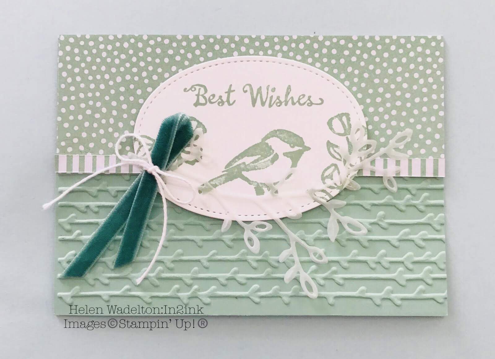
Friday, 12 October 2018
Colouring Using Stampin' Blends (2)
Today's two cards features more colouring using the same dsp from earlier in the week. Monday's cards only had the background of the dsp coloured and today's cards were completely coloured in - no white spots. This paper was so easy to colour as the design had the highlights already marked in shades of grey. When I colour with Blends I always have some scrap paper below to soak up any excess ink. This helps stop bleeding over the lines in unwanted spots. I usually start with the light shade, add the contrast with the dark shade and go over this and blend with the light shade blend. When I refer to contrast, I mean what's in shadow. This is usually where the petals overlap or the leaves touch. Alternatively, if you are unsure pretend that you are shining a torch down and work out what would be in shadow.
Hope you like my colouring and layouts.

Hope you like my colouring and layouts.

Monday, 8 October 2018
Simple Colouring using Stampin' Blends (1).
I have three cards to share. I do love colouring. I find it so relaxing and enjoyable. What was even more satisfying is that I have no more of these sheets to colour. This is a good thing - right! I don't want to be hoarding paper!
For these cards I simple coloured the backgrounds. The first card background used light Sea Foam, the second light Smoky Slate and the third light Highland Heather.

Before assembling these cards I did some more colouring with my blends, colouring the whole pieces. I share these with you on Friday.
For these cards I simple coloured the backgrounds. The first card background used light Sea Foam, the second light Smoky Slate and the third light Highland Heather.

Before assembling these cards I did some more colouring with my blends, colouring the whole pieces. I share these with you on Friday.
Saturday, 6 October 2018
Happy World Card Making Day
Friday, 5 October 2018
World Card Making Day


Here are three cards that I made from some of Stampin' Up! list of selected products. The top two are from kits (Soft Sayings Card Kit and the Lots of Happy Card Kit) and the bottom card uses the Petal Palette stamp set. Pop over to my online shop and check out the whole list of wonderful product. Have fun tomorrow celebrating World Card Making Day!
Monday, 1 October 2018
Adding Colour to Graceful Glass Designer Vellum
 A few thoughts went through my head before I began - should I use markers or blends, and which side should I colour on?
I tried both. I found that for me there was little difference with straight colouring using either blends or markers. Blending light and dark colours for shading was challenging. I tried blending with both markers and blends. You could blend the markers provided the ink was wet and in small areas. Really I just wriggled my marker, darker over light, so that it wasn't a solid line. I am referring to the purple flowers which you may not even notice the shading as it is such a small area. I tried blending shades with my blenders. I had some success with the pink flowers but ended up with a little wet mess trying to shade around the outside of the flowers. This led me to think that plain colouring looks just as good.
I coloured on the printed side of vellum. The print is a little raised, so colouring inside was easier. If you turn it over to colour, the colour is duller or muted and it is harder to stay inside the lines. I double matted both of the pieces to bring out the colours. The stained window was matted on whisper white cardstock and the bookmark was adhered with glue dots on a matching purple shade, before mounting onto black cardstock.
If you didn't work it out, I used markers on the bookmark and blenders on the card.
Christmas Card made using the Tag Punch
 Back in August I made a tag punch card for my daughter Stephanie's birthday. She loved the colour combination of the pinks and coral colours with gold. The paper was from the Painted with Love Speciality DSP. I had a lot of fun making this card and thought I would make a similar card using a sheet from the Joyeous Noel Speciality DSP. I absoloutely love this set of papers! The Christmas Greeting comes from the Timeless Tiding Stamp set. The greeting was stamped in Versa Mark and embossed with copper to tone in with the paper. I also punched the tag behind the greeting with copper foil. It was cut in half to edge the greeting. It was finished with copper thread and the gorgeous new Tranquil Tide Velvet Ribbon.
Subscribe to:
Posts (Atom)