Friday, 29 March 2019

Muted Bloom by Bloom

On Monday I shared how you can get a different look and feel too, with using a different colour combo. I couldn't stop stamping so I have two more cards to share but this time I just used two colour inks, but achieved a third by using second generation stamping.  In other words, I stamped the Smoky Slate off to get a lighter shade. I used Smoky Slate with Petal Pink and Smoky Slate with Pool Party in the other card.
Again I used the framelits from the Well Said Bundle for the word dies.


Monday, 25 March 2019

A Different Look using Bloom by Bloom Stamp Set.

The colours used in the catalogue to show the Bloom by Bloom stamp set were bold and bright, so I decided to tone it down with using Smoky Slate, Pool Party and Petal Pink ink.  A very different look!
To complete the card I used the Well Said Bundle for the stamping and word die.

Friday, 22 March 2019

Decorating the Insides with DSP.

This is a follow up from my last post.  I don't like to waste my left overs or scraps of cardstock and dsp. I made the two cards on the left with one piece of 6x6" dsp from the Garden Impressions DSP.
Sometimes I use a strip of ribbon to decorate, but in the bottom card I used the strip of cardstock left after cutting up an A4 sheet of cardstock for two cardbases.
After completing the front of the cards and used the pieces of dsp to decorate or co-ordinate the inside of the cards. Here's what I did-


Monday, 18 March 2019

Quick Cards using Garden Impressions 6x6" DSP

This DSP is part of the Garden Impressions Suite from the annual catalogue.  This suite is a favourite of mine. Today's cards used only one sheet from that stack. This sheet caught my eye as I love the Night of Navy, So Saffron and Crushed Curry colour combo.
The sentiment and tiny dies on the navy card came from the Well Written Framelits Dies and the oval shape came from the Stitched Shapes Framelits. Unfortunately, the ribbon and bakers twine are no longer available but you can subsitute that with Daffodil Delight Double Stitched Ribbon and Navy Baker's Twine from the annual catalogue.
The sentiment from the yellow card came from the Happy Gorgeous stamp set.  This is one of my favourite stamp sets for birthday sentiments. The flag banner and thin strip came from the scrap pieces left when cutting up the layers for the dsp and card bases.


Friday, 15 March 2019

Dot to Dot Textured Impressions Embossing Folder

I have 2 cards to share today which feature a dry embossed background.  This embossing folder comes from the Happiness Blooms Suite. I ran two So Saffron card bases through my machine and simply love the textured backgrounds.


The ink colour combination for this card was Mango Melody and Granny Apple Green. Yes, two colour inks only! The behind flowers used second generation stamping. Love how this can stretch your colours.
I stamped out a flower on a 'Post It Note', cut it out and used the sticky part to keep it in place. Then using second generation stamping I stamped the flowers. The result makes it appear that they are behind when in fact they were stamped after. The process was repeated with the leaves.  To give some extra texture, I stamped a smaller flower from the set and raised it with a dimensional. I also used the set of triangular dots for the flower centres (don't know the correct term but you get what I mean). Anyway it was stamped with Versa Mark and white embossed. I stamped 'happy Birthday' from the Perennial Birthday Stamp Set. Then I cut across with my trimmer under the birthday in a line, stopping to fussy cut around the flower.


Well this card evolved from putting a green ink smear towards the bottom left corner.  So I got out Stitched Shapes Framelits.  Cut the largest circle to cover it. I liked the 'happy birthday' from the previous card so I stamped that out and layered it under the circle. The large flower from the Bloom by Bloom stamp set was the obvious choice. This I raised with dimensionals.
What a quick card this turned out to be! 

Monday, 11 March 2019

Making Your Own DSP with Bloom by Bloom Stamp Set

I used to do this all the time - stamping my own dsp.  I pulled out some colour combinations and started stamping onto 6x4" Whisper White cardstock.
The first card used ink combination of Night of Navy, Granny Apple Green, and So Saffron.
The second card ink combination was Balmy Blue, Night of Navy and Highland Heather.

I cut the Whisper White cardstock down and raised it up on a frame of Night of Navy card. The 'thanks' was cut with a die from the Well Written Framelits Dies.
It was missing something so I added some White Baker's Twine. It was still missing something so I added some tiny pearls which had been coloured using my Night of Navy Blenders.


I cut the stamped piece down a little and framed it with Highland Heather card before adhering it to a Night of Navy Card. The strip of Night of Navy was a scrap piece which I embossed with White Embossing Powder using the 'for you' from the Well Said Stamp Set. The bow used some Highland Heather Organdy Ribbon which I earned free from Sale-A-Bration.

Friday, 8 March 2019

3. Brusho's and Beautiful Day Stamp Set.

 I was very guarded with the amount of Brusho's I used in the second card. I let loose with background of the first but still not overpowering.
I did dissolve some Gambage (orange) and yellow crystals in a painter's palette to add extra colour to the butterfly in the second card.
The sentiments come from Happy Gorgeous Stamp Set.


Monday, 4 March 2019

2. Brusho's and Beautiful Day


Yes I am quite pleased with how they turned out.
You can compare with the photo below.
The top card used only the flower. I didn't like the blue mess. I fussy cut around the flower.


I used the Subtles 6x6" DSPaper on both cards co-ordinating with the So Saffron and Pear Pizzazz card bases. The sentiment from the top card came from Enjoy Life Stamp set and the bottom used Varied Vases. A little piece of Pear Pizzazz trimmed the bottom card. The ribbon is no longer available but a strip of Pear Pizzazz cardstock would do the trick.


Friday, 1 March 2019

Brusho's

Brusho's have been around for quite awhile now.  If you don't know Stampin' Up! released a set of 5 colours.  They are water colour ink crystals which when mixed with water makes washes and designs.  There are 5 colours in the pack and they are Brilliant Red, Gambage (orange), Moss Green, Prussian Blue and Yellow. I have to confess I purchased these last year and they sat on my shelf. I decided to get them out and have ago after my daughter Hannah remarked, "How have you not used them yet!"

Hmm, well  Brusho's looked fun but you have little control over the final results (the crystals burst with colour when wet) and this is what stopped me I think.  Yes, you can make lots of unique backgrounds but you can do more too. So with caution I started. I think the best advice I can give
(if your a control freak) is to start with just a few specks whether you are adding to a wet or dry water colour paper or pallet. Of course, I didn't adhere to that advise strictly speaking with my first play after all you do need to see what the crystals can do!
After my initial play I became more conservative.
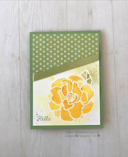
I stamped the flower and butterfly from the Beautiful Day stamped set with Versa Mark and embossed with white embossing powder. I then taped each down to a board ( to stop warping) and then spritzed the paper with water before tipping the crystals (Brusho's) onto the water colour paper.
Oh, the other best advice I forgot to say earlier was not to remove the lids but to pierce the lids with a drawing pin (to stop excessive crystals escaping - need only a few sprinkles). Store with the pin in the lid.
Well here's what I finished with. One I was very conservative with, the other not so. I didn't sprinkle madly, I did try to put , for example the yellow and orange inside the flower and green on the leaf.
I made 4 cards that I quite liked. Initially I thought some were going to end in the bin, but they survived! I shall share these with you over my coming posts.